

Fluidity
A creative design piece for Microsoft, in collaboration with Jess Buck
Design static wallpapers for the new Window OS update, light and dark mode version each. Make sure branding matches Microsoft and it is user friendly.
the
challenge

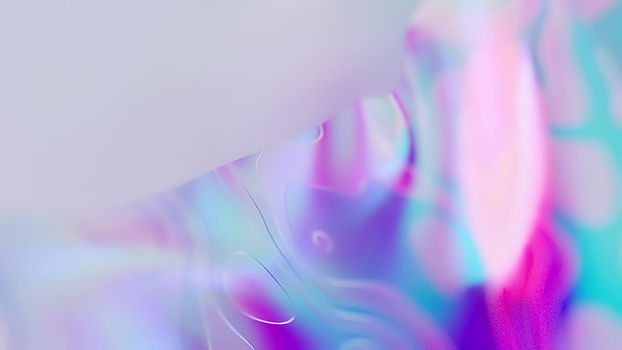
With the light and dark mode, we really wanted to explore concepts that are opposite and related to the two modes. After some exploration and further development on the concept, we thought about the range between light and dark and how fluid it can be, and that is how we landed on gradients, interesting texturing and abstractness of movements.


Here, we are also challenged to make a pitch video for our wallpapers, where you get to sell your idea, and see our designs in motion.


the
process
Here are the start and middle o our process, where everything began.
the
development
Some quick motion tests we did along the way, trying to balance out dynamic and smooth.
After the first 2 videos, we decided that the movement was too fast thus distracting, so we slowed everything down (on the right) and it worked a lot better.

After we got the speed of the movements and intensity locked down, its time to render! And here are the results we got from Redshift the denoised in Nuke <3
After most things are finished, we needed to test out our products!
So here are our what our wallpapers would look like in real life :,)


the
second concept
Bloom was our second concept that celebrates the growth of Windows alongside the user’s utilization pushed further by the visual of non traditional blooming of flowers.
We ended us not going with this direction because not only it did not fit the Microsoft aesthetic, but visually it was a bit more busy than we wanted for a wallpaper.

